| The first project is a rebrand for Pharmacist Support, showing their brand lines (that represent the Pharmacist Journey) animating on to the screen on their green brand colour background. The lines are sometimes straight and sometimes curves, like a path. Each of the lines are in brand colours; off-white, yellow and teal. An off-white line comes in from the bottom of the screen and turns into the Pharmacist Support emblem in the centre of the screen, which is the combination of the letter ‘P’ and 2 letter ‘S’s which are crossed over at the top of the letter ‘P’, one is upright and the other is rotated at a 90 degree angle to form what looks like a windmill or a flower. The line then disappears leaving the emblem, which moves over to the left, to display the rest of the Pharmacist Support logo to it’s right. |
| The second project is the brand identity for the Great British Butcher. There is a cream background and along the top, reaching about a tenth of the way down the screen, are red stripes reminiscent of the stripes on canopies outside a butchers shop. The logo consists of the brand name in a semicircle or arch over the visual of butchers cleaver with a fork and knife to the left and right of it. The the left of the fork is a herb and to the right of the knife is a chilli. Underneath these items there are 2 lines with a small union jack in the middle in between text which reads: ‘Since 1976’. |
| The 3rd project is for Four Cheers, a production company. There is the Four Cheers logo in the bottom left of the screen, which is made up of the word ‘Four’ in bold, uppercase letters stacked on top of the word ‘Cheers’ in regular weight uppercase letters. The background is made from a gradient of light blue and coral with a hint of pink and white to represent the nostalgic effect created on film when light leeks into a Super 8 camera. |
| The next project is a rebrand for Online4Baby, a baby retail website. The logo consists of the word ‘Online’ on top of ‘4 baby’. The number ‘4’ is made out of a combination of the number four and an exclamation mark to emphasise it’s bold, playful, straight-talking nature. The background is the brand azure blue. Next to the logo is an image of a happy young mum holding her smiling baby up in the air. Brand ‘expression lines’ in pink and yellow appear from their heads to represent movement and joy.. |
| Another still from the Four Cheers branding project shows 2 business cards on the side of a table or ledge. A third of each card is hanging over the edge. The business cards are the same, one is face upwards and one is face downwards. The face upward one shows the Four Cheers logo on a gradient background. The face downward one has the Managing Director’s name in a coral colour and their job title in aqua on a charcoal background. Their phone number and email address are in off white and the logo appears in the gradient. |
| Another still from the Online4Baby rebrand shows a flag brand assets in azure blue on a pink background. The flag contains their tagline: ‘Power to Parents!’ |
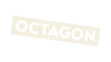
| The next project is from the rebrand of the Octagon Theatre. The Octagon logo consists of the word ‘Octagon’ in a rectangular box titled at exactly 8 degrees. The logo is on a branded purple background surrounded by brand shapes in different sizes and brand colours including aqua, yellow and pink. Some of the shapes are outlines and some are full shapes. They each gently rotate back and forth and move around a small area in a playful way. |
| The next project shows 3 photographs of event branding for Arts Council England’s ‘Art of Leadership’ conference. The first photo is of the digital signage displayed above the entrance to the Hippodrome in Birmingham. The portrait signage shows white text on a black background. The test reads ‘Welcome to the art of leadership’, with the hashtag underneath; #ACEleadership. The brand visual language framing the text consists of triangles at the top and bottom of the sign. Most are one colour triangles in aqua, green or purple. Some are duotone variations of these colours over images of people. One of the purple triangles has a patten of aqua crosses inside it. The Arts Council logo is at the top left of the sign.
The second photograph is a close up of one of the horizontal tv screens inside inside the Hippodrome foyer, with the same messaging and branding. In the background we can also a vertical screen displaying the same.
The last photograph shows a shot of the main large on-stage screen, capturing a still of the event intro animation. Triangles of different colours are overlayed, and we see a pink and yellow duotone images of 2 children in centre one. White text over the top reads ‘And how can we best engage our communities?’ We can see the bottom left corner of another large screen to the right, with a blue and green triangle and the Arts Council logo. |
| The next project is the logo and tagline from the eco-friendly coffin brand; ‘Koffin’. The logo is simple, confident, big, black, bold text of the word ‘Koffin’ on a bright yellow background.The tagline underneath reads ‘It’s your funeral’. |
| The next project is the brand identity for high end catering and kitchen outfit, Black Butter. The logo is set in copper on a teal background and consists of uppercase letters. The word ‘Black’ is stacked on top of the word ‘Butter’ which is offset to the right by one letter. Brand illustrations surround the logo, in a combination of both copper and a darker teal. They include: a sliced half lemon, liquorice leaves, a chopping knife, a honey dipper with honey dripping off of it, a steak, an apple and a ginger ale canister.
The second image from this project is of Black Butter horizontal business cards stacked in 2 piles on a concrete worktop. One pile is front side up with the copper logo on a teal background surrounded by the brand illustrations. The other pile is backside up with teal contact details on a white background with the words ‘Kitchen & Catering’ running vertically up the left hand side. There is a copper apple in the top right corner. The significance is that black butter is made from apples. |
| Lastly we see more visuals from the Octagon Theatre rebranding project. The first one is animated text in white and yellow that reads ‘Everyone’s story matters’. Surrounding the text are brand shapes in yellow, aqua and white. They each gently rotate back and forth and move around a small area in a playful way. Next we see brand photography mixed with brand assets illustrating the joy of people experiencing the magic of the Octagon Theatre.
The first image shows two young happy teenagers jumping up and two older people dancing. Each pair is framed in a purple and orange circle respectively, on a yellow background, with playful shapes scattered around them.
The second shows head shots of a middle age white lady looking surprised, and an Asian teenage girl looking delighted! They are both framed in purple hexagons on a mulberry background, with playful shapes scattered around them.
The last shows a white middle age man in a running pose framed within an orange circle. He looks excited and is wearing a grey shirt and blue jeans. He is surrounded by brand shapes including octagons, circles and squares on a purple background colour. |