Pharmacist Support Rebrand
Pharmacist Support is an independent charity working for pharmacists and students to provide help and support. The organisation recently re-focused their mission to better support pharmacists & amplify their message.
Brand focus
Pharmacist Support had always been incredibly people-centric, and the brand identity needed to catch up with their focus.
The Pharmacist Support team had done a lot strategic work on the brand, I brought in brand strategist, Chris Conlan from Outside of Ordinary to help them crystallise their vision, mission, values and brand personality.
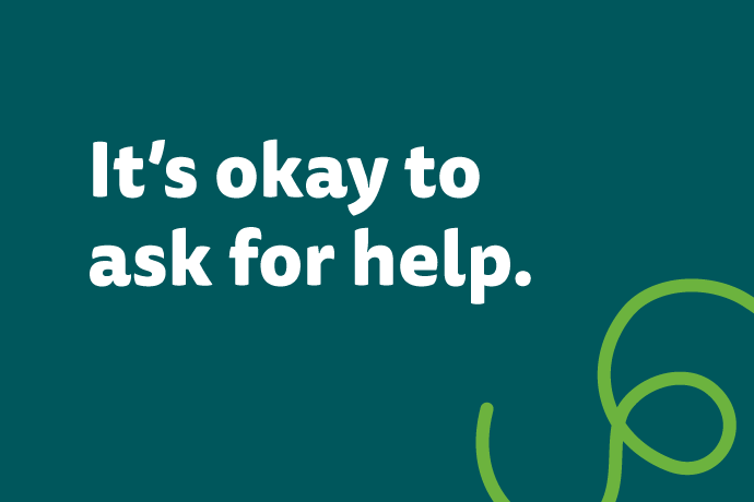
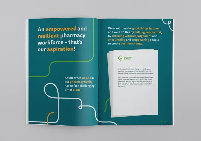
The cornerstone of the charity is their ability to listen, encourage and empower people, which forms the core of the brand essence.
The visual identity
The new identity is spiritual successor to the previous brand; keeping things familiar but fresh. An evolution, rather than a revolution.
The strategic re-focus required a revitalising of the visual identity to express the good work the charity had always carried out.
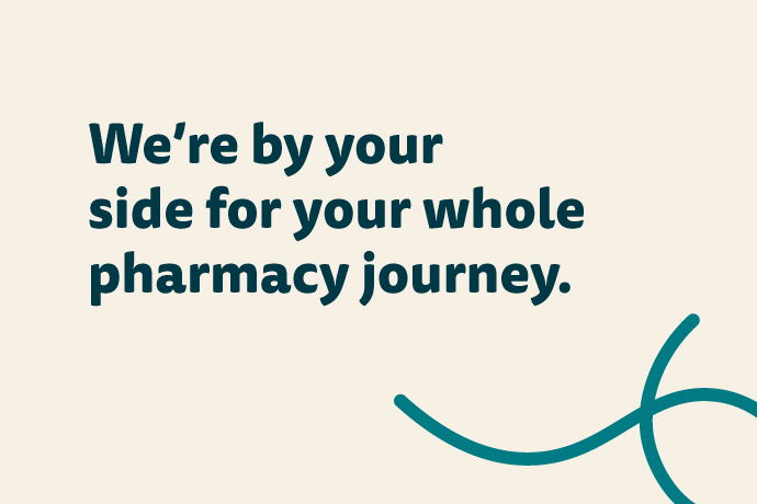
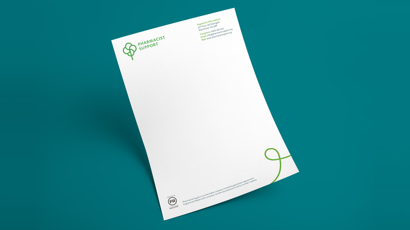
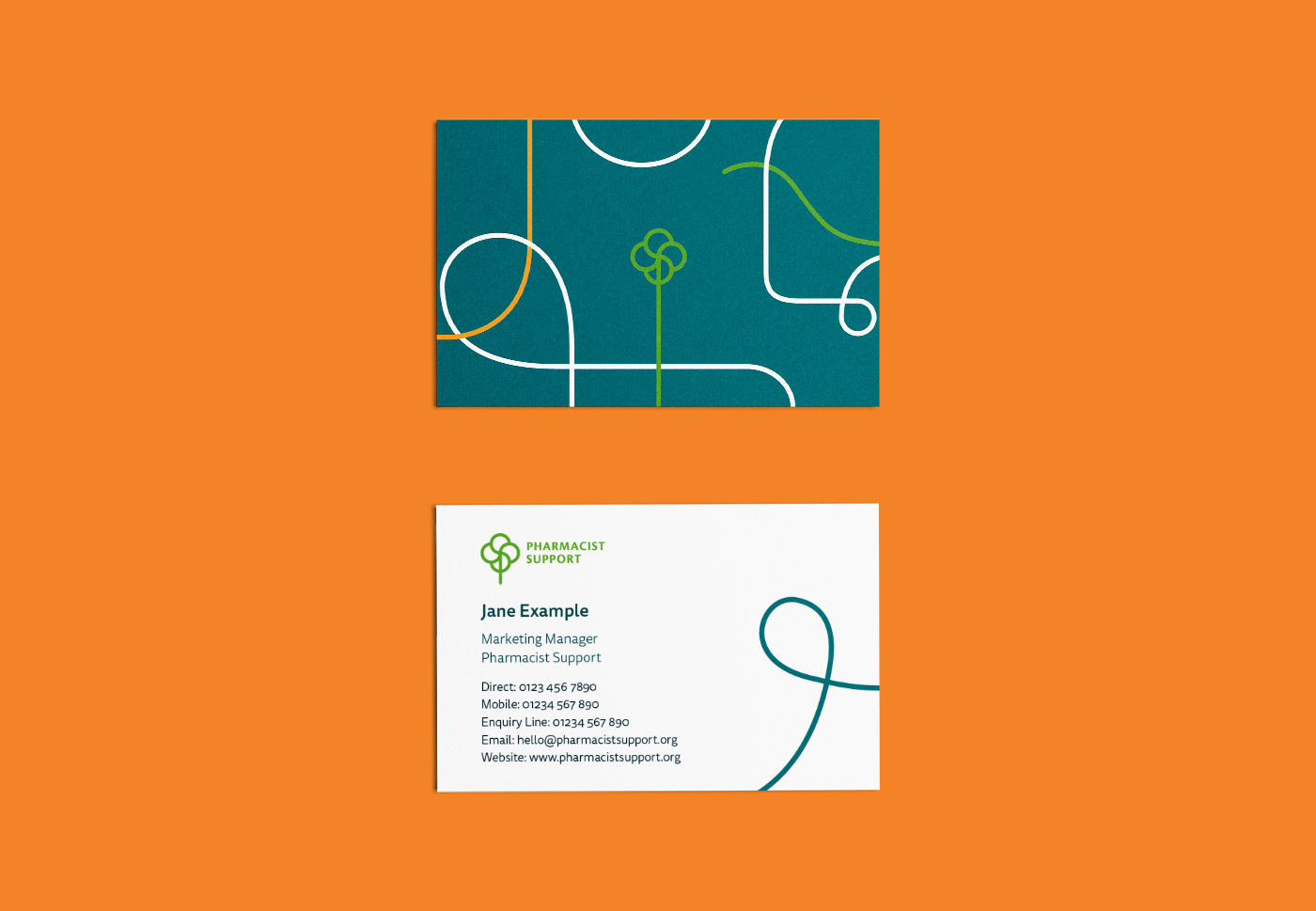
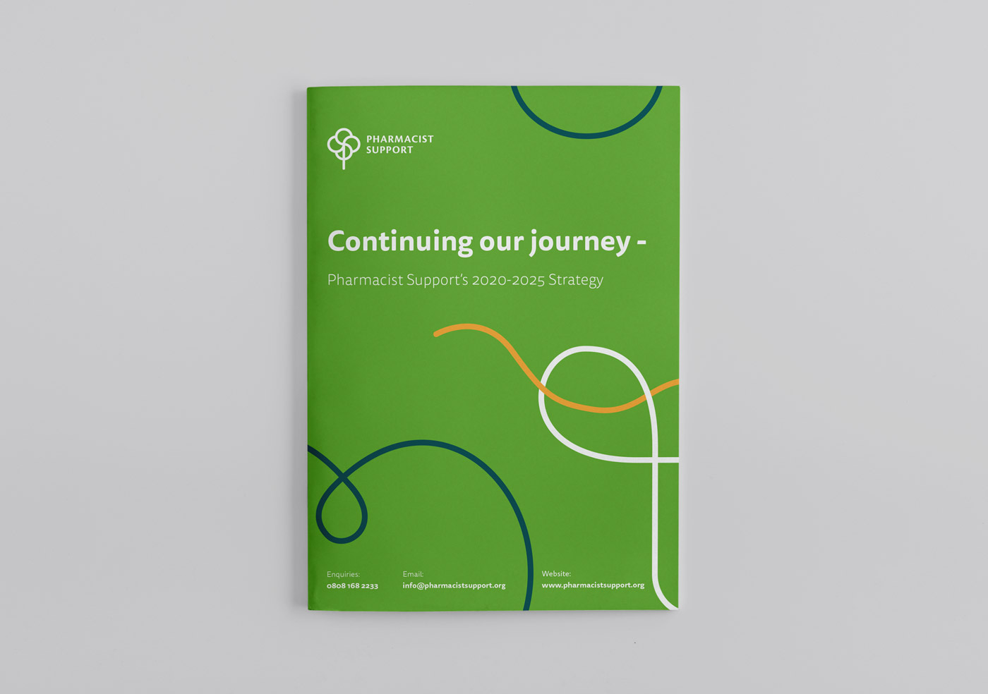
A decision was made to keep the majority of the existing colour palette, since it was strong, warm and approachable – completely on-brand for the charity. The only modification was to swap out brown for teal as a better solution for readable type and a more modern aesthetic.
The logo execution was refined by tidying up the emblem and swapping out the previously harsh logotype for a typeface with rounded edges set in uppercase to signify strength.
A new, brand typeface was introduced – soft but clear, approachable but professional.
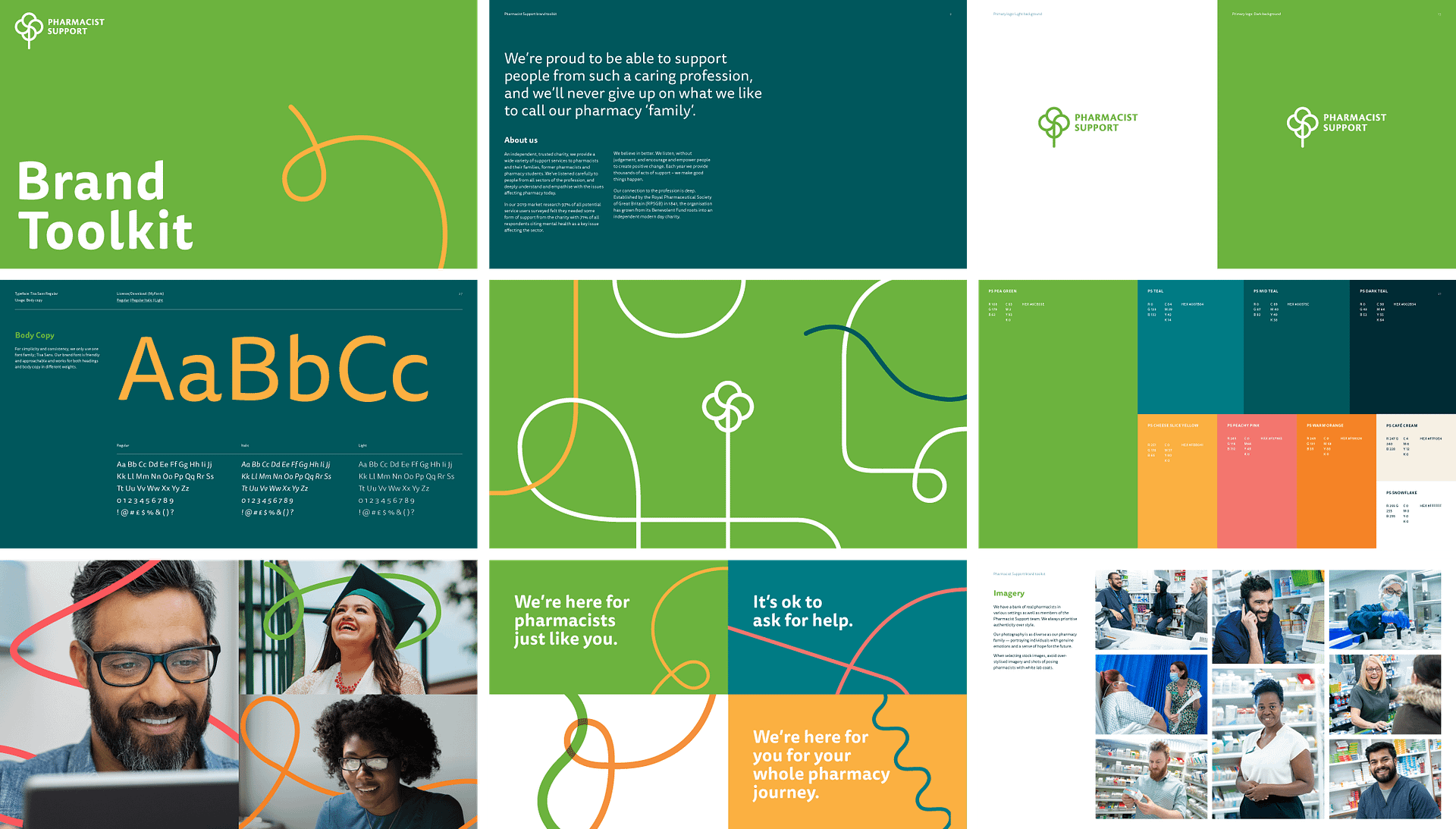

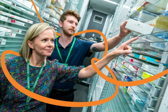
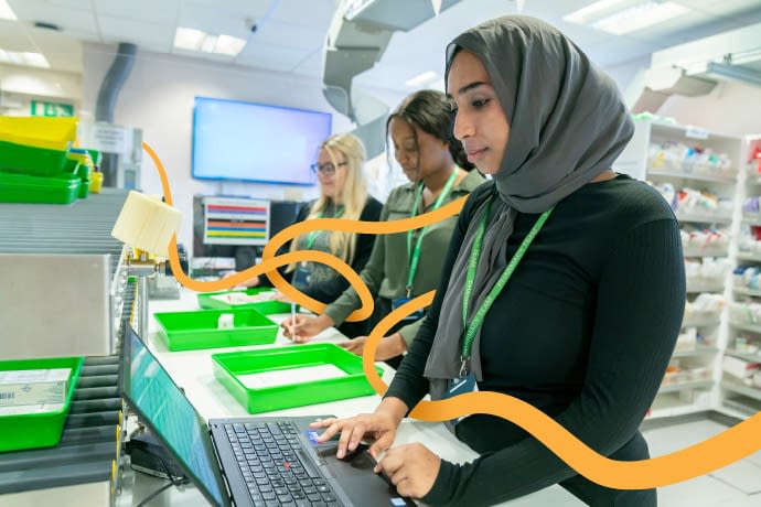
The stem of the logo also becomes a path that is used as a graphic device to represent the pharmacy journey. When used in conjunction with photography of people it provides a visual embrace or a metaphor for a caring hug. As such creating a relationship between the brand values and visuals.
Messaging was built around the archetype of Empowering Caregiver, using data from strategic market research commissioned by the charity.

Pharmacy family
People have always been at the centre of everything Pharmacist Support do, so it made sense to build the brand around them. From the people who seek support, to the people who are there to give it. Being a pharmacist in itself is a caring profession, and Pharmacist Support are there to embrace, what it calls, it’s ‘pharmacy family’.
The Empowering Giver
The charity prides itself on taking up the role of an empowering caregiver; they are compassionate and reassuring, positive and optimistic. Visually every design decision made reflects this. From the upbeat and positive colour palette, to the softened brand typography, supportive messaging and tone of voice that are both reassuring and motivational.
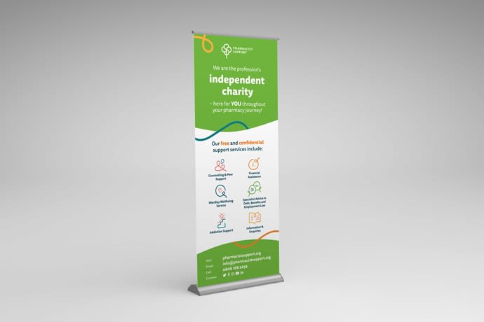
Service icons
The journey theme as represented by lines was continued throughout the visual language, including the charity’s 6 core services.
Brand application
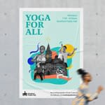
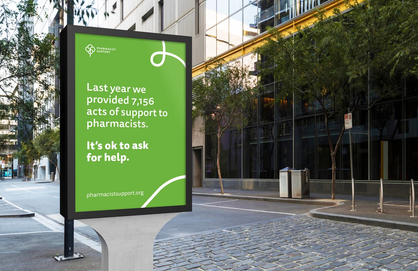
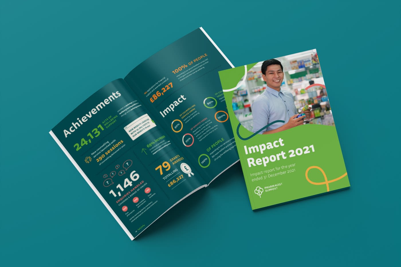
The brand was rolled out across multiple applications, including stationery, wellbeing packs, pop-up banners, marketing & communications materials and annual reports.
Kate Westbrook, Pharmacist Support See review on GoogleOur charity has worked with Angela at Love & Logic for around 10 years now. During this time she has led on our brand refresh, and helped us develop a range of marketing and events materials – from the more formal annual reviews and reports right through to creative events and fundraising materials and props!
She has also delivered a number of digital projects for us including animations to support our wellbeing programmes and to celebrate our 175th anniversary, and more recently a Wellbeing hub that we developed in response to COVID to support our wellbeing campaign activities.
Angela is reliable, responsive and creative – she has never let us down and is an absolute joy to work with. Love&Logic has very much become an extension of our marketing team!